Pages

Wednesday, September 28, 2016

Lesson 2: Summary

Lesson 2: Summary

Concepts:
  1. Adding and subtracting volumes.
  2. Allowing thicknesses and depths.
  3. Using leading edges.
Observations:
  • Working from the top down can be problematic. If you don't get the angles and proportions of the roof right, the rest of the building will not be right either.
  • I'm still making the windows too big.
  • It's hard to balance accuracy and spontaneity.  Drawing carefully slows you down and makes the lines look too stiff and stilted.
  • My indoor drawings improved as I went and helped a lot when I did the outdoor drawings.
  • The leading edges technique works with other subjects.
Questions:
  • Should I return to the same location to finish the sketch (add watercolor)?
To-Do:
 Work bigger.
 Work faster.
 Try using erasable highlighter for set  up and layout.
 Measure basic vertical and horizontal distances and compare relative sizes.
 Find the midway points of basic shapes.
 Make angles steeper. Compare angles to clock.
 Draw windows smaller.
 Write in all caps.

Jim

Lesson 2: Outdoor Exercise 2

Lesson 2: Outdoor Exercise 2

I drove to Silverton and sketched the Gordon House this morning.
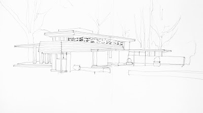
Gordon house finished drawing
Finished Drawing

It was cold and mostly cloudy. I sat there for almost two hours looking at this house and figuring it out on paper and then sketching it. My goal this time out was to produce a measured drawing getting the proportions and angles right and my lines straight and controlled. When you are on location, you have to figure out where on the "sketch vs finished drawing" spectrum you want to be. I wanted to try an accurate drawing at the far end of the spectrum.

I started with a thumbnail sketch done in pencil of the basic volumes. I used the front left facing wall as a unit of measurement (A) and compared the other widths and heights to it on my initial sketch. The left hand side was way too long as drawn.
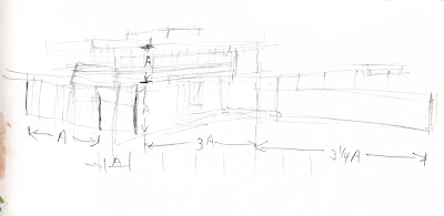
Working drawing
Small thumbnail working drawing in pencil to figure out the volumes and proportions.


I then turned the page and laid out the building across both pages using pencil and then I inked in with a Micron Pigma 02 pen. Finally I added the shapes of some of the trees in the background and the small hedge in the foreground.

I was getting cold and tired and ran out of energy. I quickly added the complicated shaped windows on the second floor, packed up my gear, and headed for lunch.

Later I noticed that I had missed a few elements of the structure - the left hand support pillar for the cantilevered second floor porch and the right hand support post for the car port. I would like to come back and finish by adding watercolor.

Proportions and angles are good. The length of the car port is short by about a quarter. Other than that, I think this is a good representation of the building.

My skill at drawing long lines straight is getting better if I am careful and turn the paper. I used two methods. I drew one or two lines in pencil using a ruler and judged where to draw parallel lines in ink based on the pencil line. I also drew dots at the end points and drew dot to dot.

Materials: Strathmore large softcover journal, pencil, Micron Pigma 02 pen.

Gordon House is the only building in Oregon that was designed by Frank Lloyd Wright. It was one of his Usonian houses and used to sit on a hill overlooking the Willamette River. The house was saved from near destruction in 2000 and moved to its present site in the Oregon Garden near Silverton, Oregon.

The house is most often pictured from the left side and is indeed beautiful from every side.

The posts and beam holding up the cantilevered second story porch were added a few years ago. I don't know the story behind why they were added. I assume they are a temporary fix because the ground shifted or they put the house back together again incorrectly, but they were not part of Wright's original design.

Gordon house

Gordon house

Jim


Lesson 2: Outdoor Exercise 1

Lesson 2: Outdoor Exercise 1

Our assignment was to sketch a house.
house 1

I actually did this drawing before I did the indoor exercises and it shows. I made many of the mistakes that Liz addresses in the indoor exercises. I got the angles of the roof wrong which made the proportions of the sides of the house wrong. I made the windows too large and the roof of the porch is too big. I was surprised by how difficult is was to draw a simple two story house. So, I learned a lot. You often learn more by attempting to do something before reading how to do it.

Materials: Canson Mix Media 7x10 inch spiral bound pad, pencil, Pentel EnerGel 0.5mm ball needle point liquid gel pen.

Jim

Lesson 2: Exercise 2, Thicknesses and Depths

Lesson 2: Exercise 2, Thicknesses and Depths

This exercises was all about thicknesses and depths. Again we worked from a photo reference. 
thicknesses and depths
We were to pay particular attention to the thicknesses of the beams and columns and the depth of the roof and windows.

Materials: Canson Mix Media 7x10 inch spiral bound pad, Zebra disposable brush pen extra fine nib.

Jim

Lesson 2: Exercise 1B, Volumes and Accuracy

Lesson 2: Exercise 1B, Volumes and Accuracy

In this exercise we were to revisit one of our four 1A drawings.
revisiting exercise 1A
I re-did the first example. I added a little more window detail and some context.

Materials: Canson Mix Media 7x10 inch spiral bound pad, Zebra disposable brush pen extra fine nib.

Jim

Lesson 2: Exercise 1A, Volumes

Lesson 2: Exercise 1A, Volumes

The theme of this exercise was local houses. We worked from four photo references of houses in Tasmania from Liz Steel. We were to draw directly in ink without any pencil setup.

four houses
These were supposed to be quick volume sketches, but I got carried away and spent about 20 minutes on each sketch carefully observing the angles, proportions, leading edges, and placement of each shape drawing slowly and purposefully.

Drawing buildings is all about visualizing as you go. When drawing in ink, you have to slow down and think about all of these issues before you commit to a line.

Materials: Canson Mix Media 7x10 inch spiral bound pad, Zebra disposable brush pen extra fine nib.

Jim

Lesson 2: Overview

Lesson 2: Overview

During the second week we explored constructing volumes in more depth. We investigated three ideas:

  1. Adding and subtracting volumes.
  2. Allowing thicknesses and depths.
  3. Using leading edges.
There are three steps involved:
  1. Seeing the base volumes.
  2. Adding elements.
  3. Subtracting elements.
Indoor Exercises:
The indoor exercises introduced us to the concepts and allowed us to practice in a relaxed environment.

First we did four drawings of houses from photo reference. We drew directly with ink with no pencil setup.

Then we revisited one of our sketches and tried to improve upon it.

Finally we did another house paying particular attention to thicknesses and depths

Outdoor Exercises:
Our assignment was to draw a house. I did two drawings. I did the first before doing the indoor exercises and it has many of the common mistakes that Liz addresses in her review of the indoor exercises.

I did the second one after reading her materials for the week. I took my time and did a carefully planned, controlled drawing.

Jim

Sunday, September 18, 2016

Lesson 1: Summary

Lesson 1: Summary

Concepts:
  1. Feeling Edges
  2. Abstracting Shapes
  3. Constructing Volumes
Observations:
  • Line quality matters. The work I admire has less shakey lines.
  • I underestimated the dry time between washes. You can see in the positive shapes sketch that the largest dark window bled into the mid tones.
  • I'm still having a hard time judging placement on the page.
  • Shadows shifted as I drew and painted. What happened is I painted the shadows as they were at the moment. So, the net result is that the painting records the shadow shifts over time and is not a snapshot of a moment in time.
  • I saw and wanted to add more detail, but I resisted the temptation.
  • I tried mixing juicer mixes of watercolor. This made things a lot easier because I didn't run out of a color and have to stop and remix more.
  • Each sketch took longer than anticipated. The entire exercise took me over two hours to complete.
  • I lost track of time and became oblivious to my surroundings including the people around me. A few people walked up behind me to look at what I was doing and surprised me when they made a comment. They were all complimentary by the way.
Questions:
  • What do you do while waiting for paint to dry?
To-Do:

Try dry media or wet media that dries quicker such as Neocolor II, colored pencil, or markers.
Practice lines and curves and angles.
Figure out page placement techniques so objects don't go off the page.
Practice lettering.

Saturday, September 17, 2016

Lesson 1: Church

Lesson 1: Outdoor Exercise - sketch a church.

St. Mary's Church


I did this sketch while attending the Oktoberfest in Mt. Angel, Oregon. I did four sketches of this church starting with a continuous line drawing to warm up and discover aspects of the building.
Continuous Line
Next, I did some abstracting of shapes. First I looked at the negative spaces of the sky and the windows.

Negative Spaces
Then, I looked at the positive shapes of the building itself.

Positive Spaces
After lunch I switched positions and painted the final sketch head-on using the constructing volumes technique. I drew in pencil first and added watercolor in several washes - the sky, light tones, middle values, and finally the darks.

Constructing Volumes
Next I drove up the hill to Mt. Angel Abbey. I wanted to check out the buildings with the idea of coming back later to sketch them. There are many beautiful buildings on this campus including a famous library designed by Alvar Aalto. It was such a beautiful day I decided to sit down and sketch the church. I used a brush pen first and then added color with Daniel Smith watercolors. It turned out to be my favorite sketch of the day.

Mt. Angel Abbey


Mt. Angel Abbey with sketch


Location Notes:

  • I underestimated the dry time between washes. You can see in the positive shapes sketch that the largest dark window bled into the mid tones.
  • I'm still having a hard time judging placement on the page.
  • Shadows shifted as I drew and painted. What happened is I painted the shadows as they were at the moment. So, the net result is that the painting records the shadow shifts over time and is not a snapshot of a moment in time.
  • I saw and wanted to add more detail, but I resisted the temptation.
  • I tried mixing juicer mixes of watercolor. This made things a lot easier because I didn't run out of a color and have to stop and remix more.
  • Each sketch took longer than anticipated. The entire exercise took me over two hours to complete.
  • I lost track of time and became oblivious to my surroundings including the people around me. A few people walked up behind me to look at what I was doing and surprised me when they made a comment. They were all complimentary by the way.
Jim

Lesson 1: Manly Church

Lesson 1: Indoor Exercise - Manly Church

Again we all worked from a photo reference.


The assignment called for doing four sketches:
  1. Continuous line - draw without lifting the pen from the page.
  2. Abstracting negative spaces - paint the sky shape and then the window shapes
  3. Abstracting positive spaces - paint the silhoutte of the building with a light color, paint the midtown shadow shapes, and then add the darks.
  4. Constructing volumes - draw the main volumes in pencil and guidelines for all the windows, and then add ink. 


Continuous Line

Negative Spaces


Positive Shapes
I really like the look of the positive shapes without any ink lines. This technique of working in three or four values is a classic method of working in watercolor used by English artists in 1800's.

I ran out of time and didn't do #4. Constructing volumes. Instead I went straight to the outdoor exercises.

Jim

Lesson 1: Boxes

Lesson 1: Indoor Exercise - Boxes

We all worked from the same photo reference for this exercise.


We did four sketches:
  1. Blind contour - draw without looking at the page. (This helps warm up your hand-eye coordination).
  2. Continuous line - you can look, but don't lift the pen from the page. (This is an excellent method for learning about the parts of your subject and seeing how they are related. However, it's difficult to get the angles and proportions right and the lines straight).
  3. Abstracting Shapes - draw the edges of the blue shapes and shade them in with blue pencil. (Helps to see the shapes - both positive and negative).
  4. Constructing volumes - draw the basic box shapes first with pencil, then add ink. (This produces the most finished looking sketch because you plan it out first).


Blind Contour and Continuous Line
Abstracting Shapes and Constructing Volumes


Jim

Lesson 1: Line Exercises

Lesson 1: Indoor Exercise - Line Practice

For our first exercise we did a bit of line practice - making strong lines, parallel lines, long straight lines, dividing lines, angles, drawing squares, converging lines, and a few patterns.

Straight lines

Angles

Boxes, Converging Lines, and Patterns
This takes me back two years when I took Liz's Foundations course. I discovered in week two that I couldn't draw straight lines very well. So, for the next four weeks I practiced drawing lines. I researched various suggestions and techniques and devised my own method of practice. My goal was to draw straight lines at any angle or in any direction without turning the page or using guidelines. Afterwards I collected and scanned all my practice sheets and created this PDF to document my process and findings. It really does help to do targeted practice.

Jim

Lesson 1: Overview

Lesson 1: Overview

During the first week we reviewed and practiced three ways of visual thinking.

  1. Feeling Edges
  2. Abstracting Shapes
  3. Constructing Volumes
Indoor Exercises:

First we did a bit of line practice - making strong lines, parallel lines, long straight lines, dividing lines, angles, drawing squares, converging lines, and a few patterns.

Then we did a series of drawings of boxes (from a photo reference) using blind contour, continuous line drawing, abstracting shapes, and constructing volumes.

Finally we did another series of drawings from a photo reference of Manly Church. We did continuous line, negative space, positive space, and constructing volumes.

Outdoor Exercises:

The assignment was to sketch a church on location using all the methods we used indoors - continuous line, negative space, positive space, and constructing volumes. I sketched St. Mary's church in Mt. Angel, Oregon.

Jim