Pages

Monday, November 14, 2016

Course Summary

I reviewed all the course materials and made a mind map of the course concepts.

Course concepts mind map
Here's a link to a PDF of the mind map.

Things I learned or figured out how to do:


  • Line Quality matters.
  • I underestimate dry time.
  • Page placement techniques
    • layout big shapes
    • use FriXion pen.
  • Draw things that move first
    • shadows
    • people
  • Spontaneity vs. Accuracy
  • Using leading edges technique works with other subjects.
  • Use clock to measure angles.
  • Analyze structure and design first to aid drawing.
  • Setup really helps.
  • Many building spaces are divided by thirds.
  • I like using markers and learned to thin and blend and mix them and tested values.
  • Difference between shade and cast shadow - value and color.


Concepts and tips to take forward:


  • Resist detail.
  • Time management.
  • Stay alert to surroundings.
  • Find midway points of basic shapes.
  • Make angles steeper.
  • Analyze structure and design first, then draw.
  • Do a setup. Even a little helps. Fast then slow.
  • Pay attention to drawing straight verticals and horizontals.
  • Differentiate shade and shadow.
  • Practice:
    • lines and angles
    • color mixing
    • analyzing structure and design.

Jim

Monday, November 7, 2016

Epilogue

Epilogue

After class I continued to sketch buildings.


Marker first, then pen. From my own photo reference.

Course concepts used: abstracting shapes, using leading edges, using a basic unit of measure (the width of the first story of the central part of the building), and mapping shade and cast shadows.

Materials: Canson Mix Media 7x10 inch paper, Faber-Castell PITT Artist brush pens, Sailor Fude 55 degree fountain pen with Platinum Carbon Black ink, and Uni-Ball Signo #UM-153 white gel pen.


I did this sketch while waiting in a parking lot. This time I was testing watercolor in my new journal. The paper handles light washes really well and does not ball up or buckle or bleed through.

Course concepts used: measuring angles, using a basic unit of measure (in this sketch I compared the width of the right hand walll with three windows to the remainder of the house), using grey pens to map shade and cast shadows.

Materials: Ranger Dylusions Creative Journal 5x8 inches, Micron 02 pen, Faber-Castell PITT Artist Cold Grey III pen, Daniel Smith watercolors.


This is a very complicated building. My most challenging one yet with a crazy curved facade and lots of windows, shadows and reflections. Line first, then watercolor, and white gel pen.

Course concepts used: constructing volumes, allowing thicknesses and depths, using a basic unit of measurement (in this case I used the height of one story of the central clock tower), and leading edges.

Materials: Ranger Dylusions Creative Journal 5x8 inches, Kaweco Sport fountain pen with Platinum Carbon Black ink, Lucas watercolors, and Uni-ball Signo UM-153 white gel pen.


Basically there are two ways to draw, with care or with abandon. Usually I block things in, measure angles and relative sizes and strive for accuracy. Occasionally, however, I like to just dive right in, work quickly, and throw caution to the wind. What you lose in accuracy you gain in liveliness.

I like working with a watersoluble pen. The brown washes that you see were pulled off the line work with a waterbrush. It's a fast way to sketch and I like the look.

Course concepts used: blocking in basic shapes first, using leading edges, and mapping shade and cast shadows.

Materials: Ranger Dylusions Creative Journal 5x8 inches, Kuretake Zig Letter Pen CocoIro Extra Fine Sepia, Pentel medium round waterbrush, Uni-ball Signo UM-153 white gel pen.

Salem Hospital Building M

This is the new rehab unit at Salem Hospital. I'm using different media today. I'm trying Neocolor II watersoluble crayons and a new ink in a dip pen, but instead of dipping into an ink bottle I'm storing the ink a small plastic eydrops bottle and putting a drop of ink on the nib as needed.

Course concepts used: blocking in basic shapes first, using a basic unit of measurement (in this case I used the width of the right hand brick wall), mapping shade and cast shadows, and simplify window reflections.

Materials: Ranger Dylusions Creative Journal 5x8 inches, Neocolor II watersoluble crayons, Dr. Ph. Martin's Bombay Sepia India ink with a Tachikama pen holder and Speedball #512 nib, Pentel medium round waterbrush, Uni-ball Signo UM-153 white gel pen.

Jim

Lesson 4: Summary

Lesson 4: Summary


Concepts:
  1. Mapping light and dark
  2. Refining the dark side and adjusting the light side
  3. Try different methods and workflows.
Observations:
  • I discovered I really like markers (Faber-Castell PITT Artist pens) and prefer using them over pencils for value studies.
  • I learned to look for and notice the value and color differences between shade and cast shadows.
  • I did extensive testing to determine the values of the PITT pens and how to mix and blend them to get additional values and colors.
  • I was surprised to see that my color perception and mixing is pretty good. There was very little difference between the two Lucca watercolor sketches - one where I applied local color first and then shadows and the other where I applied shadow color first and then local color.  The order of application didn't seem to matter much. 
  • My angles and proportions are getting better the more i draw, but it still takes me a long time to draw accurately (upwards of an hour). 
To-Do:
 Continue to study color theory and practice color mixing.
 Continue to practice analyzing building structure and design.
 Try Neocolor II on location instead of watercolors or markers.
 Revisit all the course materials and concepts.

Jim

Lesson 4: Outdoor Exercise

Lesson 4: Outdoor Exercise

I sketched my own house for this exercise. Using markers I first sketched a value study. Then I did a full color version with markers.

Value and Color Sketches

In each version I first did a quick pencil layout and then worked with markers - light grey, middle grey, dark grey, and black for the value sketch and lightest colors to darkest colors in the color sketch.

I'm starting to feel more confident that I can get the colors and values I want using markers. They are very different from watercolor.

Materials: Canson Mix Media 7x10 inch paper, pencil, Faber-Castell PITT Artist brush pens, Micron Pigma 02 pen.

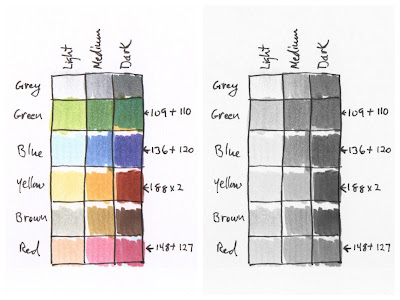
Before doing these I did a series of marker value tests in order to find out the values of the color markers.

PITT Artist Pen values

I used an image editor to drop out the color. There aren't a lot of dark values right out of the pen.

PITT Artist Pen Values

So, in this next test I did grouped the markers by color and experimented with getting the dark values by mixing colors.

PITT Artist Pen Values

I experimented with ways to get additional colors and values by mixing colored markers. On the left I tried getting shades of colors by mixing color with greys. I discovered that if you lay down two layers of the same color, it is darker than just one layer. On the right I made additional values by double layering colors. At the top I mixed compliments - yellow and violet, orange and blue, red and green. At the bottom are experiments with blending two or three colors one on top of the other. On the far right I tried making a wash of color (light blue) without streaks. It's possible, but you have to work fast, scribbling back and forth wet into wet. I tried a single layer, two layers in different directions, and three layers in three directions.

Later I learned how to thin and blend markers. The trick is to gesso the paper first. The ink stays wet on the surface of the gesso so you can push it around, blend it, and even lift it off until it dries (several minutes or until you blow dry it which is what I did). This allows you to build up the color gradually and achieve subtle effects. You can also use a plastic palette, blend two colors on the palette, and then use a blending brush pen or waterbrush to transfer the color to the paper. The other trick I used was to use a white wax pencil as a resist. I drew in the areas I wanted to remain white. PITT pen ink beads up over the wax and even after it dries you can wipe it clean, back to white, with a tissue.

I did a sunset sketch to test my new knowledge of how to thin and blend colors.

PITT Artist Pen sketch of Yachats Sunset


Jim

Lesson 4: Indoor Exercise Part 2

Lesson 4: Indoor Exercise Part 2

I did two watercolor studies using different workflows. The first (on the left) I added the local color first and then did the shadows. In the second (on the right) I did the shadows first and then added the local color.

Color Study - Lucca

They turned out pretty similar. I was surprised. The light side of the buildings are a little bit lighter in the one on the right, but not much.

Materials: Canson Mix Media 7x10 inch paper, Micron 02 pen, Royal 1/4" dagger brush, and Daniel Smith watercolors.

Jim

Lesson 4: Indoor Exercise Part 1

Lesson 4: Indoor Exercise Part 1

I sketched two versions (for comparison) from a reference photo of a Tasmanian cottage - one in pencil and the other using markers.

Mapping Light and Dark - Tasmanian Cottage

I did the pencil sketch first. I used three different values of grey watercolor pencils and black. I was pleased with the result and then I tried the markers. Wow. I was able to work much faster and the result had a lot more punch because ink has much more contrast than pencil. Again I used three values of grey plus black. I started each drawing by laying down a mid tone grey in the shadow shapes, then a dark grey, then a light grey, and finally black paying attention to differentiating between shade with reflected light and darker cast shadows. I like how some shapes (like the chimneys for instance) are defined by their shadows. I didn't have to draw an outline around their edges.

Materials: Canson Mix Media paper, Faber-Castell Albrecht Dürer watercolor pencils, Faber-Castell PITT Artist brush pens.

I also did another marker value sketch from a supplied photo reference of Manly Tower.

Mapping Light and Dark - Manly Tower

I first did a pencil sketch and then used markers to map the shadows. Finally, I added black.

Materials: Canson Mix Media 7x10 inch paper, Derwent Blue Grey watercolor pencil, Faber-Castell PITT Artist brush pens, and Micron 02 pen.

Jim

Sunday, November 6, 2016

Lesson 4: Overview

This week we are adding color and value to our drawings.

Concepts:

  1. Mapping light and dark
  2. Refining the dark side and adjusting the light side
  3. Try different methods and workflows.
We learned a three step process for doing value studies.
  1. Map all the dark areas in a mid-tone grey.
  2. Refine the dark side by adding a darker grey to all the areas of cast shadow.
  3. Look at the local color and then apply this over the sketch as needed.

Indoor Exercises:

Part 1: Value Study. I did three drawings mapping light and dark from supplied photo references. The first was done with pencil. The second and third were done with markers.

Part 2: Color Study. I did two watercolor and ink drawings from the same photo reference. In the first one I added local color first and then added the shadows. For the second one I did the shadow areas first and then added local color.

Outdoor Exercise:

Our assignment was to sketch a simple building, to first do a value study to map the light and dark and then sketch the building in color. It was our choice whether to start with shadows or local color.

Jim

Thursday, October 6, 2016

Lesson 3: Summary

Lesson 3: Summary


Concepts:
  1. A structured way of working – the seven-step process.
  2. The power of guidelines - alignment, centerlines, horizontal ledges, and adjustments for thicknesses.
  3. Some measuring tips for getting better proportions - look for squares, use a basic unit of measure, and measure between guidelines.
Observations:
  • The most important takeaway from this week was the realization of the importance and benefit of understanding the structure and design of a building before drawing it. Shapes, angles, and proportions are based on structure and design. Analysis pluses intuition. Understanding the anatomy of a building helps when you draw it, and drawing helps you understand how a building is put together.
  • Measuring always takes longer than just going for it in ink. It's the old problem of speed versus accuracy. If you have the time, however, it is really worth it to do a setup.
  • It's remarkable how just a few well placed setup lines can speed up the process and make such a world of difference in the finished sketch.
  • Buildings look wonky when vertical lines aren't vertical and horizontal lines aren't horizontal. I need to pay attention to drawing straight verticals and horizontals.
  • An advantage of doing a setup is that it is a good warmup exercise. It gets both observational skills and hand-eye coordination going before you draw with ink.
  • Working on location is more problematic than working in the studio.
  • Many building spaces are divided by thirds.
Questions:
  • Can you recommend a visual dictionary of architecture for artists?
To-Do:
 Work on verticals and horizontals.
 Make a few important horizontal and vertical setup lines using a ruler and then use those as guides for other lines when drawing with ink.
 Practice analyzing building structure and design.
 Check setup against the building or a photo and make corrections to the setup before starting to draw with ink.

Jim

Lesson 3: Outdoor Exercise, Adolph Block

Lesson 3: Outdoor Exercise, Adolph Block

Adolph Block watercolor
I drove downtown (Salem, Oregon) and parked across State Street from the Adolph Block building which was built in 1880. It was a cold and rainy morning, so, I sketched from inside my car. Parking on this street is diagonal parking, not parallel. I had to turn and look back from the driver's seat to see the building. Holding my large journal and handling my supplies was difficult in the cramped space that I had.

I took a reference picture with my iPod Touch and used it to analyze the building's design. I did a quick pencil sketch on a small piece of paper. The building is three sets of squares top and bottom with a small piece added onto the right side which I assume is a stairway to the second floor. I also determined the placement of the windows and doors. The top story windows are three to a square, are the same size, and are spaced evenly. The first floor is divided in half vertically with windows above and entrances and display windows below. I also used three dots to find the height and width of the triangular shaped tree foliage.

5 step sketch
I then used this knowledge to draw setup lines in my journal. I drew with a Pilot erasable FriXion orange highlighter pen. Next I used a Kaweco Sport fountain pen with Platinum Carbon Black ink to draw the details over the setup. All this took about an hour. I ran out of time and energy and had to stop before I could add the watercolor.

I used a hair dryer at home to erase the orange highlighter pen, and then added watercolor while looking at the reference photo I had taken on my iPod Touch blown up large on my desktop computer's monitor. I used Daniel Smith watercolor and two brushes - a 5/8 inch filbert to start and a #6 round for added detail. I worked in successive steps of color from light to dark. I used a hair dryer between each pass to speed things up.

Working on location is more problematic than working in the studio. In this case I couldn't see very well through the rain on the car window. I misjudged the placement of the halfway line between the stories which made the top story windows too long and the ground level windows and doors too short. I should have caught that by comparing the setup sketch with the building or photo, but I didn't. Next time I'll try to remember to check before adding ink.

Jim

Lesson 3: Indoor Exercise 2, Capitoline Hill, Rome

Lesson 3: Indoor Exercise 2, Capitoline Hill, Rome

We worked from a supplied photo reference. Again we were to work through the drawing using the lesson concepts - a structured way of working, guidelines, and measuring to get better proportions.

I first did a setup sketch to lay the building out in my journal and set the proportions of the building pieces. I used a Pilot erasable FriXion orange highlighter pen so that I could later erase the setup lines.

I then added ink on top of the setup lines using a black Zebra disposable brush pen with a fine felt tip. I chose this pen because it is capable of making both fine and bold marks and because it is waterproof.

Capitoline Hill
Notice I adjusted the ink lines as I drew and didn't follow the orange guidelines if I thought the angle or proportion was wrong (for instance I adjusted the height of the tower and the angle of the right staircase).

Next I erased the orange setup highlighter lines with a hair dryer.

Capitoline Hill ink
Boy, that sure works great to get a clean drawing. It's much better than trying to erase pencil. You don't smudge the ink.

Finally I added watercolor. 

Capitoline Hill watercolor
I layed in the sky first (working wet-on-wet) with a 5/8 inch filbert brush and blotted out a few clouds with a tissue. I used the same brush to paint the light tan of the upper story. I then darkened the mix with a little cerulean blue to add the shadows. The small details were done with a #6 round brush.

Doing a measured setup solves a lot of problems and saves time because you don't have to do separate analytical pencil sketches to work out the proportions and placement of the major building elements. However, measuring always takes longer than just going for it in ink. It's the old problem of speed versus accuracy. If you have the time, however, it is really worth it to do a setup, because the more you know about the subject and its underlying structure and purpose, the better.

The other advantage of doing a setup is that it is a good warmup exercise. It gets both observational skills and hand-eye coordination going before you draw with ink. 

Jim